 Wesley Hilliard
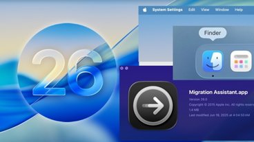
When Apple initially announced macOS Tahoe 26, it showed a redesigned Finder icon that moved the blue color to the right side, which went against nearly 30 years of history. Monday's beta fixes that.
Apple's attention to detail has widely been regarded as near-perfect, at least in terms of design. However, there are moments when the need to introduce something new for the sake of new wins out.
As Stephen Hackett, 512 Pixels writer, Apple history buff, and cofounder of Relay.fm podcasting network pointed out, the swapped color scheme in the macOS Tahoe 26 Finder icon was an . The darker color has always been on the left side of the Finder icon.
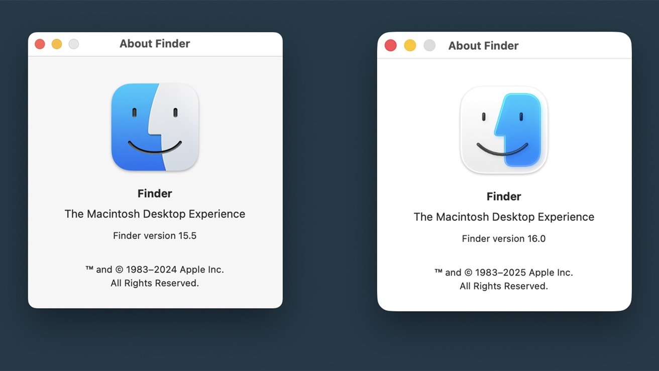 Apple initially swapped the colors for the new macOS redesign. Image source: 512 Pixels
Thankfully, with the second developer beta of macOS Tahoe, the icon coloring has been restored while retaining the new style. It seems that Hackett's vocal and passionate outcry against the change, which he repeated across his numerous podcasts and blog posts, brought about some change.
This was confirmed during WWDC by MacStories Editor-in-Chief Federico Viticci the Apple SVP of Software Engineering Craig Federighi. While not shared in his published interview, he during the Connected podcast that Federighi had indeed heard about Hackett's plea to fix the Finder icon.
It goes to show that Apple is paying attention to feedback, at least when it comes to the more vocal folks writing and podcasting about Apple. While it doesn't always work, it is important for all of us Apple enthusiasts to remain critical and provide useful feedback, especially where Apple forgets itself and its history so blatantly.
Finder's iconic icon
The Finder icon originated as a logo in the System 7.5.3 boot screen and survived as an icon in various screens until it was used for Finder in Mac OS X. The darker color was on the left through all of that and various redesigns over the decades, so it seemed odd that Apple swapped the colors in the first place.
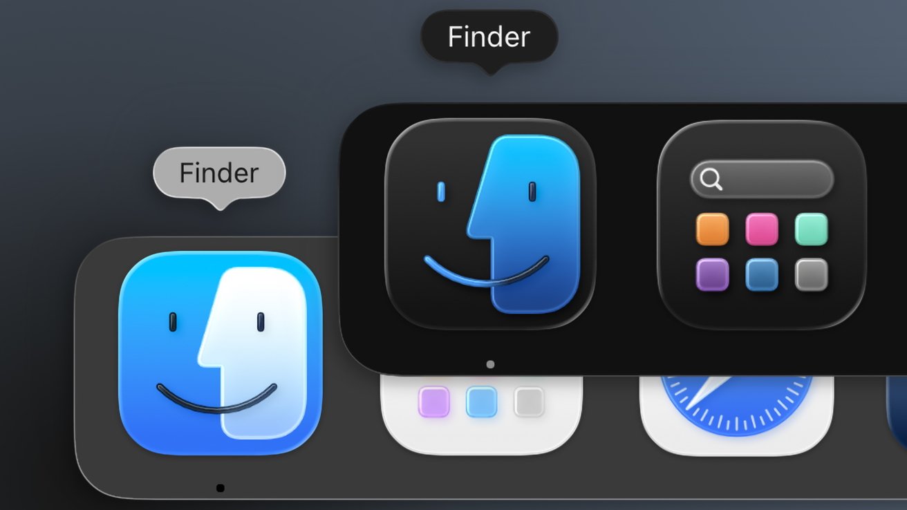 The dark mode icon maintains the darker color is on the left
I'm not sure that I buy that it was a random designer making a change for the sake of change. It seems they arrived at a design that allowed the color to wrap the icon and made the transparent color the dominant one to emphasize the Liquid Glass material.
That design philosophy carried over into the new beta 2 icon, which has the color on the left side wrap the entire icon, enclosing the color on the right. This time, however, it is the blue that dominates the logo with the smaller side now transparent white.
When in dark mode, the Finder icon swaps the dark blue to the right, but in keeping with tradition, the left side color is still the darker gray/black. That dark icon is a big departure for the Finder, but at least it and the light icon maintain the previous design standard.
Some have already taken to calling it a "half mask," referencing opera costumes and the like. At the least, even with the subtle changes, Finder's latest icon continues a tradition into the new glassy era of Apple design.


-m.jpg)


 Marko Zivkovic
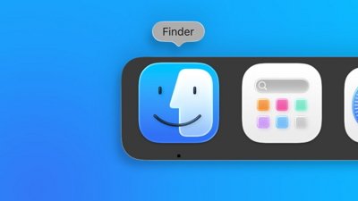
 Malcolm Owen


 Andrew Orr


2 Comments
OMG they changed an icon’s coloring, then changed it back. I wondered why the planet had temporarily tilted on its axis, but now all seems fine I guess, unless of course another change is coming, then oh dear god hang on to the new trolls these changes will enrage.